Since I’ve had a website, I’ve been redoing it. Over and over, playing styles and themes and metaphors. Never content, I went through iteration after iteration. Each iteration walking through varied works in progress – moving items here, blatantly stealing paradigms there. Part of this was just the passion of web and graphic design. And, most of these versions never saw the light of day, until now.
The moment that you feel, just possibly, you are walking down the street naked, exposing too much of your heart and your mind, and what exists on the inside, showing too much of yourself…That is the moment, you might be starting to get it right.” – Neil Gaiman
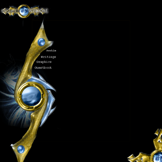
2004 – Obscure Wisdom
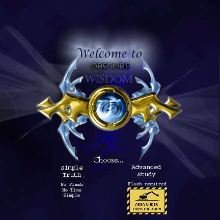
- Flash Version – Check
- Halo soundtrack – Check
- Excruciating load times on a 56k modem – Check
- Guestbook – Check
Version 1
Version 2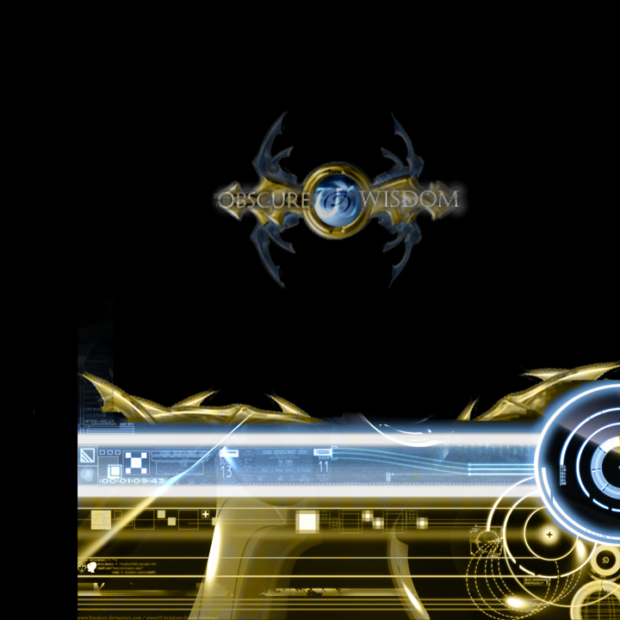
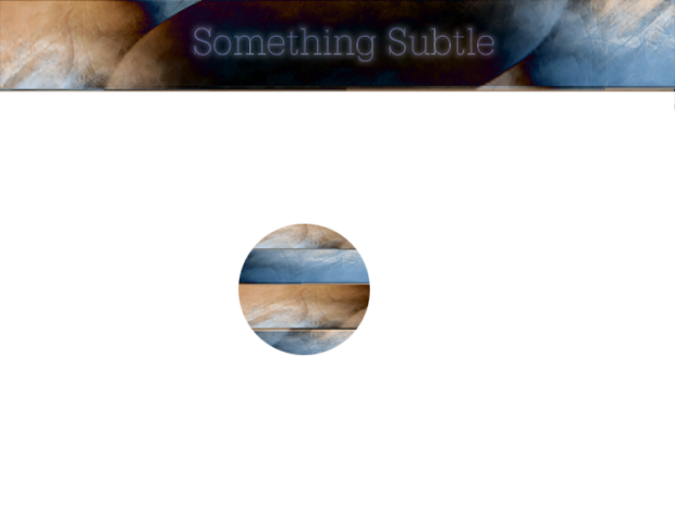
This thing went through a handful of iterations, both on the normal and flash side. I think there was a heavy influence from the look of things like Halo and Starcraft, two very formative design languages in my youth. Looking back at it, its interesting to see the slow creep of slightly more organic elements. The technology moving towards metallic thorns. Overall, this era was mostly defined by my efforts to teach myself flash, my obsession with animations, and the thought that style could overwhelm substance.
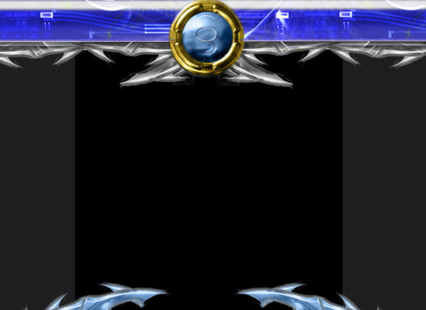
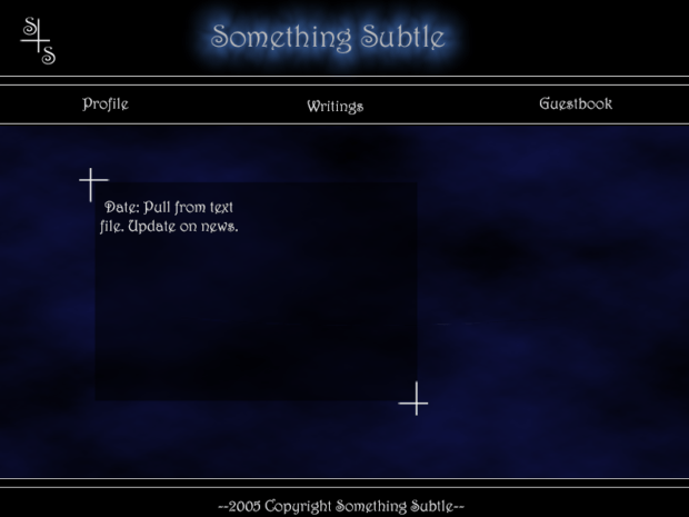
2005 – Early Something Something
- Flash Version – Check
- Guestbook – Check
- Simplifying things – Check
Work in Progress 1
Work in Progress 2
Experiments
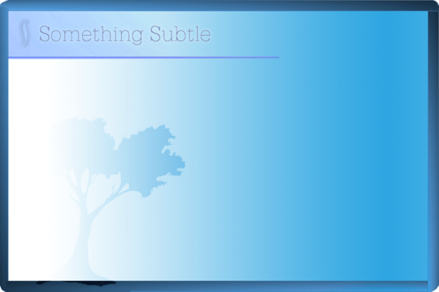
So, although I was still working with Flash, I begin to simplify things immensely. I started to aim for the typical Header, Body, Footer structure that worked well with text. I started to lean on my content (for what horrible high school poems are worth) and seeing what I could do within a more subdued space. Its fascinating to see my experiments that begin to play with very different textures and looks. I was really trying to find a general voice for what ‘Something Subtle’ meant. It looks like I started to congeal around a font and general atmosphere, which worked its way into 2006’s versions.
2006 – A Sense of Normal Tree
Intro Page Text – In the realm of internet design, I have learned that content is key. The text is the purpose you are here. The text and the meaning behind it. Everything else is just art, eyecandy. It is meant to accent the text, but not eclipse it. In many versions of my website, I have had to make many compromises between form and function. In this iteration, I think I may have finally succeeded in a happy middle. Something professional, content driven, yet artistic and……. subtle.
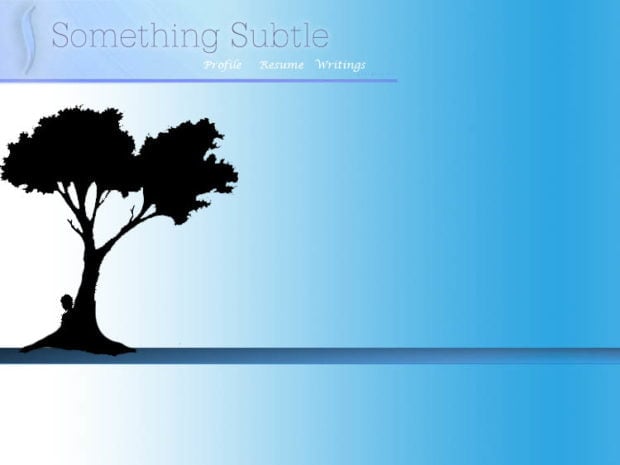
I think these were my earliest experiments with Ajax and minimal loading methods. How could I just change the pages that need changed? But, some major themes begin to take hold – Solid backgrounds and simple embellishments. A fun find is my tree with 3 clickable apples that allowed different downloads of my resume. (Who downloaded a Word doc?) Arguably, I think this general style and theme would become a staple of my future redesigns.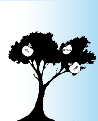
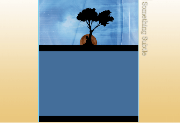
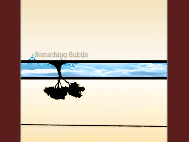
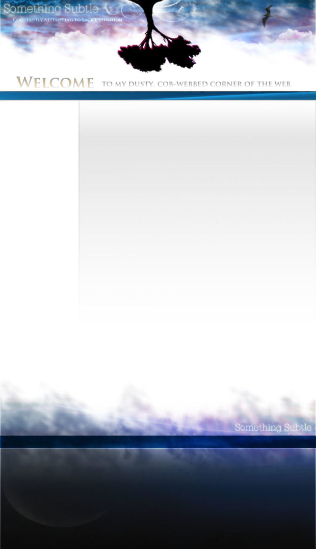
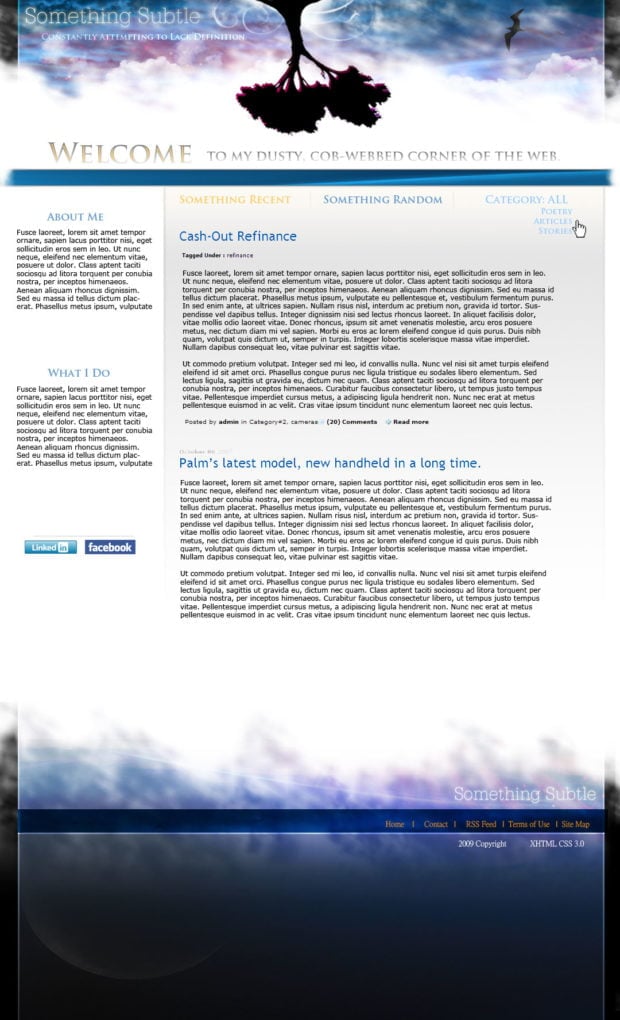
2008- Blue, Gold, and an upside down tree..
Work in Progress 1
Work in Progress 2
Live Version
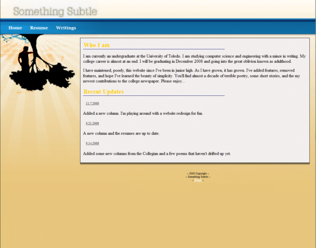
So, it seems the next few years were ones of refinement. Tweaking the color scheme, embellishing the embellishments, turning the tree upside down, and calling out the content space more clearly. If I recall, these were the days I was mastering CSS and using it more prominently. Screens were getting wider and centering content was becoming all the rage. This meant handling backgrounds and edges either more clearly or removing them completely. This was a fun time, and I remember enjoying this design for quite a while.
Its fascinating reading my ‘About Me’s throughout the years:
I am currently an undergraduate at the University of Toledo. I am studying computer science and engineering with a minor in writing. My college career is almost at an end. I will be graduating in December 2008 and going into the great oblivion known as adulthood.
I have maintained, poorly, this website since I’ve been in junior high. As I have grown, it has grown. I’ve added features, removed features, and hope I’ve learned the beauty of simplicity. You’ll find almost a decade of terrible poetry, some short stories, and my new contributions to the college newspaper. Please enjoy…
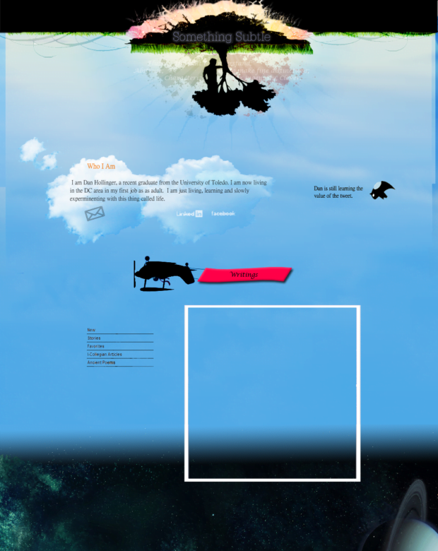
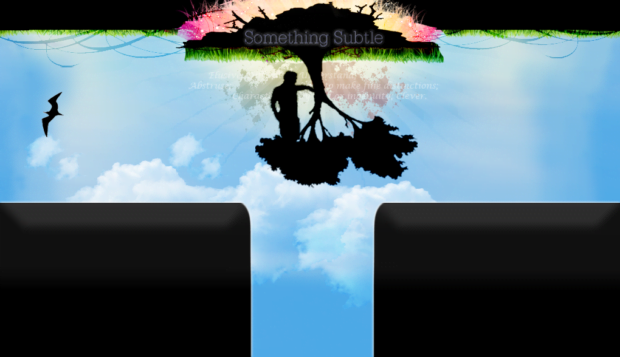
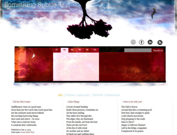
2009- Lets go Deeper, and Use Social Media
Work in Progress 1
Skys the Limit
All the way to space…
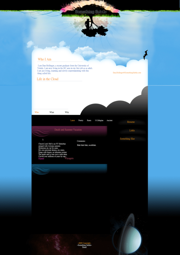
It looks like I was on a kick to add more complexity once again. More categories, more images, more sections and sub-sections. I had finally moved to WordPress as my content management system. This allowed me to go a bit more wild with specific category CSS and designs. I find the motif fascinating. I went from clean, solid backgrounds to an entire upside down earth-to-space theme. That poor upside-down Twitter bird! It was definitely a fun period, but I think I was ultimately bored after work and seeing what I could come up with. Looking back, I find it fascinating that I decided to break out the dirt around the tree and provide a splash of color. I appreciate the contrast against the pale blues.
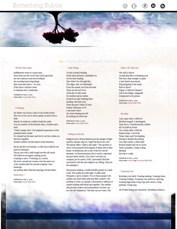
2009- Simplifying a Little, then not at all
Two Columns and the sky
Two Columns and the sunset (sunrise?)
Two columns with content and textures…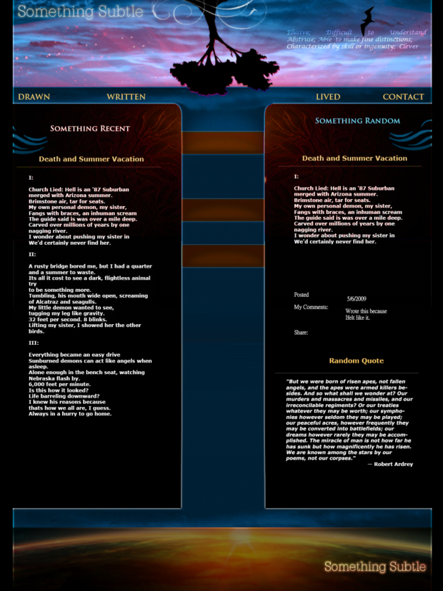
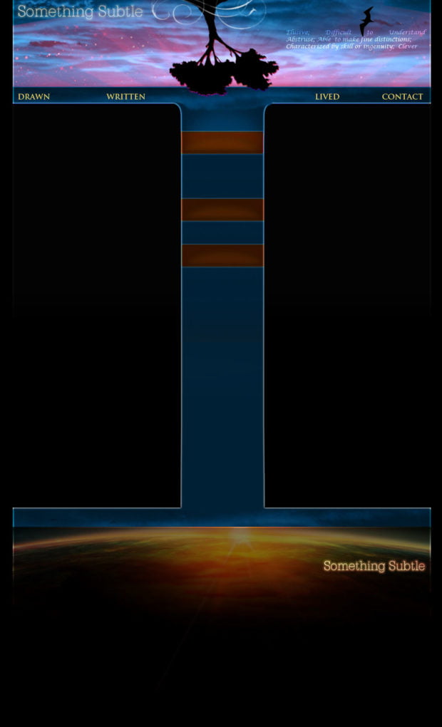
The Trio…
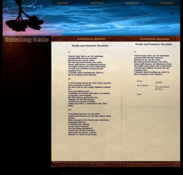
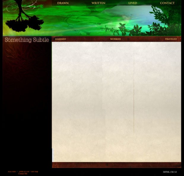
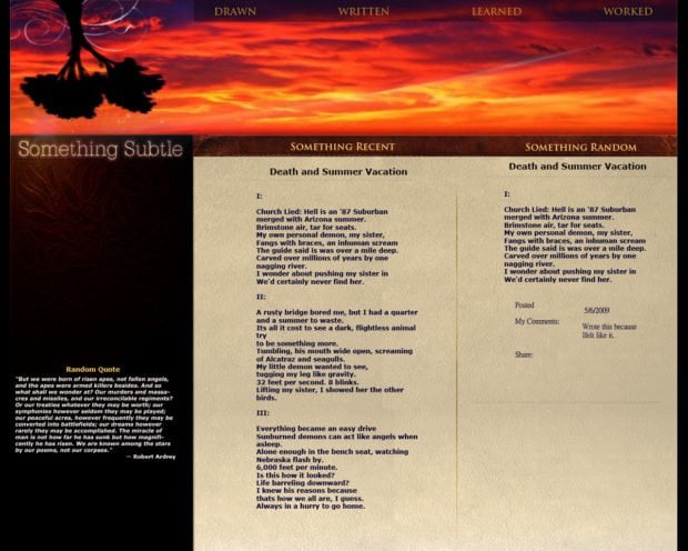
This was a fascinating period experimenting with the leather book textures, splashes of multiple colors, and a distinct departure of my previous metaphors. Once again, I tried to bring the content front and center and rid myself of some of the worst gimmicks. I enjoy the Trio, which would have brought in different hero images for each section: Drawn, Written, Learned, Worked. However, I think I was still going way to complicated for my own good. The next round is much more a step back and a move to my current, more modern look. And of course, the upside tree was here to stay.
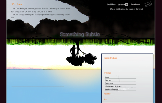
2011- Simplifying a Lot
The design language of today…
Experimenting with a vibrant hero banner…
The final look for a while.
Overall, there was a general movement back to the content, and exposing as much of it as possible. This held through to my current version, where I try to surface the most recent content and have everything else available along the side. Ultimately, I’m relying more and more on customized themes and am not putting as much effort into the graphic design and artistry. Who knows, maybe in a few years, I will get the itch to go down this road once again and redesign the entire website once more. Until then, I hoped you enjoyed the embarrassing scroll through some of my websites that never were.